What Is Gantt Chart?
Gantt Chart in Excel is used to visually represent the plans and schedules of a project. It is a project management tool that shows how the project is performing in different time intervals.
Though Gantt chart is not an inbuilt chart by default, we can create Gantt charts with ease in simple steps.
For example, consider the below data.
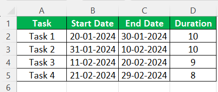
For the given data, we can create Gantt chart in Excel as shown in the below image.

In this article, let us learn how to create Gantt chart in Excel with the following examples.
How To Create A Gantt Chart?
Although using a specialized online Gantt chart maker would be much easier and faster for this purpose, it is still possible to create one in Excel. The following Gantt chart examples outline the most common Gantt charts in Excel. It is impossible to provide a complete set of examples that address every variation in every situation since there are thousands of such charts. Instead, each Excel example of the Gantt chart offers a step-by-step methodology for creating such a chart, relevant reasons, and additional comments.
Though MS Excel does not have a Gantt as a chart type, we can create it with the help of the Excel “Insert column chart“ or “Bar chart” in the “Insert” menu of the “Chart” section. It is very simple for any task-related or time-bound project to track and monitor daily. In addition, it provides many feathers that make it easy to digest the chart.
Explanation of Gantt Chart in Excel Video
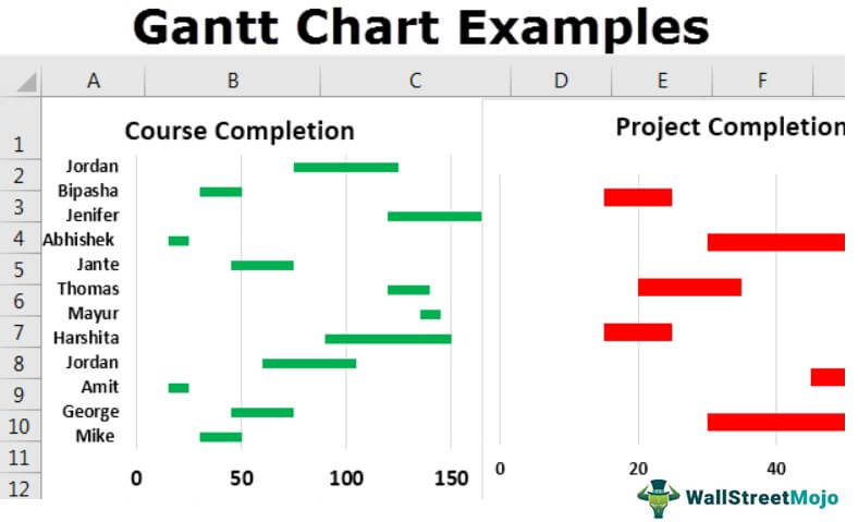
Examples
Example #1: How To Create A Gantt Chart In Excel
For example, a user wants to create an Excel Gantt chart of course completion from the student details table.
- We must first open the MS Excel and go to Sheet1, where the company keeps student details.
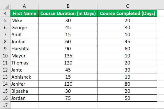
- The user wants to create a Gantt chart of the student course completion, so we must select the table data, which is cells A1 to C13.

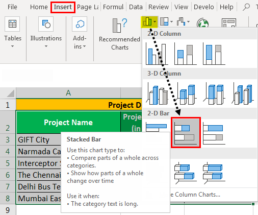
- Then, we must go to the Excel menu bar and click on the “Insert”> click on the “Insert Column” or “Bar chart” of the chart toolbar. Then, we must select the “2-D Bar” under “Stacked Bar” > the basic chart will appear on the worksheet.

- Change the color from the “Chart” menu as per requirement.

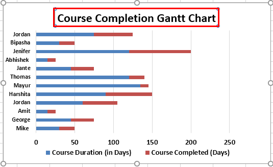
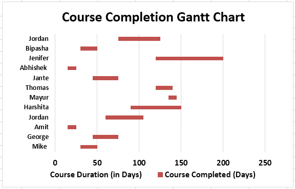
- Now, we must provide the chart title as “Course Completion Gantt Chart.”
- Now, select the chart – click on the blue strip of the chart – right click on the chart – one pop up will be open.

- Go to the “Fill” drop-down from the menu pop up – select “No Fill.”

- As soon as the chart is inserted, it will look like the one below.

- Now, click on the worksheet and save it.
Summary of Example 1
A user wants to create a Gantt chart for the course completion of their student. As a result, they can easily understand and track the status of course completion day-by-day by updating the table data. Therefore, it will reflect the same in the Gantt chart.
If a user wants to make a Gantt chart more attractive, they can choose different bar colors, gridlines in Excel, labels, and more to do in the chart with the help of the “Format Chart Area” menu. But, of course, it will be more attractive to the reviewer, whoever will see the chart.
Example #2: How To Create And Customize The Gantt Chart In Excel
Some projects are going on in some different locations in India, and project details have some entries like “Project Name,” “Project Duration (in Months),” and “Completed Status (in Months).”
For example, a user wants to create a Gantt chart of the project completion from the project details table.
Step 1: We must first open the MS Excel and go to Sheet2, where the user keeps the project’s data.

Step 2: As the user wants to create a Gantt chart of the project completion, select the table data, cells A2 to C8.

Step 3: Now, click on the “Insert” – click on the “Insert Column or Bar Chart” of the chart toolbar, then select the “Stacked Bar” chart.
Step 4: Change the color from the chart menu as per requirement.
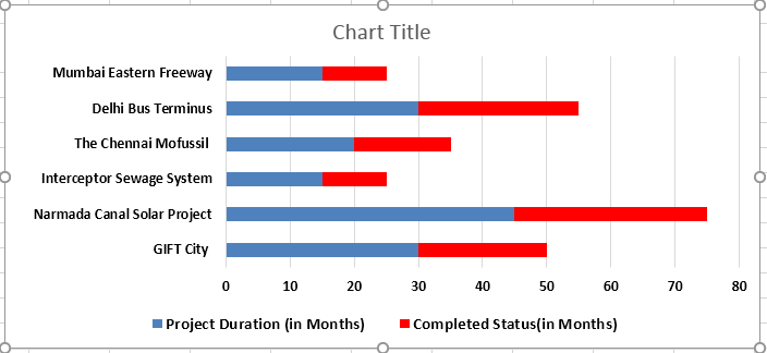
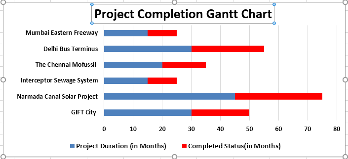
Step 5: Now, provide the chart title as ‘Project Completion Gantt Chart.’
Step 6: Now select the chart – click on the blue strip of the chart – right click on the chart – one pop up will be open. Select “Format Data Series” – One side menu bar will be available.

Step 7: Go to “Fill” and “Line” menu – select “No fill” under the “Fill” options.

Step 8: There are many options available to change the chart color, “Fill,” “3D Format,” “Chart Property,” and the size of the chart.
Step 9: Click on the worksheet and save it.

Summary of Example 2
A user wants to create a Gantt chart for project completion of the different projects. As a result, they can easily be understood and track the status of project completion day-by-day by just updating the table data. It will reflect the same in the Gantt chart.
If a user wants to make a Gantt chart more attractive, they can choose different bar colors and add new gridlines, labels, and more to work in the chart with the help of the “Format Chart Area” menu. Consequently, it will be more attractive to the reviewer, the people who will see the chart.
Example #3
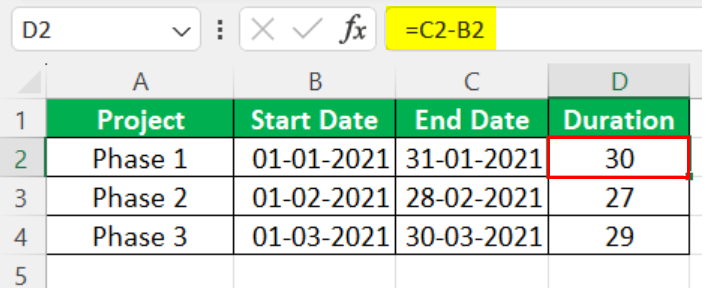
For example, consider the below table showing different phases of a project.

Let us learn how to create Gantt chart in Excel.
First, we need to find the duration using the formula = End Date-Start Date.
Then, click on “Insert”- “Insert Column” or “Bar chart” of the chart toolbar. Then, we must select the “2-D Bar” under “Stacked Bar” – the basic chart will appear on the worksheet.
Change the color from the “Chart” menu as per requirement.
Now, select the chart – click on the blue strip of the chart – right click on the chart > one pop up will be open.
Go to the “Fill” drop-down from the menu pop up – select “No Fill.”
As soon as the chart is inserted, it will look like the one below.
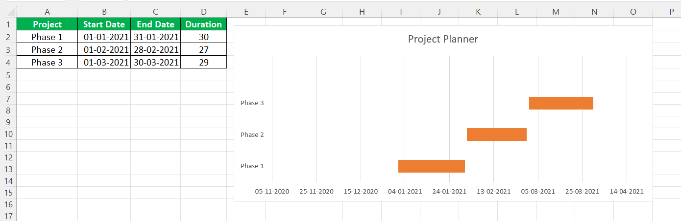
Likewise, we can create Gantt Chart in Excel.
When To Use A Gantt Chart
- When a project is going on, and the resource manager or supervisor wants to track the team’s work progress, he can plot a Gantt chart of his resources in the project. Then, through the project, the supervisor can follow the work progress and ensure the smooth workflow of the team.
- If a team leader knows the team’s work progress by the Gantt chart, he can plan for the future task by seeing the chart.
Important Things To Note
- The “Legend” of the Excel chart is not more important than the Gantt chart. It does not have much information as we delete other parts of the data.
- If a user is making any change in the table data, the chart will change automatically to the changes made in the table data.
- MS Excel does not have a Gantt as a chart type, but we can create it with the help of the “Inset Column or Bar Chart” stacked bar chart. So, it does have inbuilt capabilities to develop also.
- If users do not want a chart title, they can remove it by clicking on the chart title and deleting it.
- There is no MS support for the Gantt chart. A user needs to change as per their requirement.
- A user can customize his Gantt chart by choosing different bar colors and adding new gridlines, labels, and more to do in the chart with the help of the “Format Chart Area” menu.
Frequently Asked Questions (FAQs)
1) What are the limitations of the Gantt Chart in Excel?
A few limitations of the Gantt Chart in Excel are,
• It plans or forecasts the project proceeding ahead of time. However, if there are any schedule changes, then it is challenging to deal with the modifications.
• Since, the chart takes the changes on priority, we can only plan for a week or so. Planning more than that may be a waste of time if we have to change from the start.
2) Where is Gantt Chart in Excel?
We do not have an inbuilt Gantt chart in Excel. However, we can use the 2-D Stacked Bar Chart using the path given below.
First, choose the dataset, select the “Insert” tab, go to the “Charts” group, click the “Insert Column or Bar Chart” option drop-down, select the “Stacked Bar” chart type from the “2-D Bar” category, as shown below.

3) Why is Gantt Chart in Excel not working?
The Gantt Chart may not work for the following reasons,
• The data is updated or modified and the chart is not refreshed.
• In large datasets the data is complex to display. If its time frame is outside the timeline currently displayed in the Gantt chart, we cannot see the changes. In such cases we can move back and forth using the navigation tools.
Recommended Articles
This article has been a guide to Gantt Chart Example. We discuss creating and customizing the Gantt chart in Excel and the downloadable Gantt chart example template. You may also look at these useful functions in Excel: –