What Is A Combination (Combo) Chart In Excel?
Combination Charts in Excel, or most commonly known as Combo Charts in Excel, are a combination of two or more different charts in Excel. To combine two charts, we must have two different datasets but one common field combined.
We can create the Excel Combo Charts from the “Insert” menu in the “Chart” tab to make such combo charts.
For example, we have the data below of a student’s score for different subjects and overall percentage.
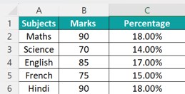
In such cases, we can plot the subjects on the X-axis, and the Marks and the percentage on the Y-axis using the Combo Chart can help present and compare two different data sets related to each other in a single chart, as shown below.

The generated chart shown above is a combination of a Bar chart and a Line Chart to display the 2 data variables in the Y-axis.
Key Takeaways
- The Combination Charts in Excel are multiple charts combined on a single chart to display datasets separately to avoid overlapping data.
- These charts are known as Combo Charts in the newer version of Excel, i.e., it is available from 2013 and later versions.
- As we generate one single chart and modify it into a combo chart, we save time and space in a worksheet. Ensure to keep it simple, as the more complex it is, the more difficult it becomes to comprehend.
- When we plot different series of the same dataset, it becomes easy to compare, just with a glance, even when the data is modified.
How To Create A Combo Chart In Excel?
We can create Excel Combination Charts using the inbuilt charts available in the Excel Charts group. For example, we can use Bar charts and Line chart, Column charts and a Line chart, etc. We will see with examples how to combine two charts to get a combo chart.
Examples
We will consider some examples to generate Combo Charts in Excel.
Example #1
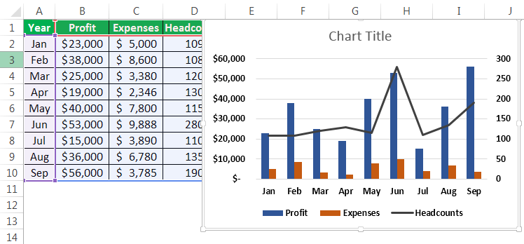
Consider the below example wherein we have profit, expenses, and headcount plotted in the same chart by month. We would have profit and expenses on the primary Y-axis, headcounts on the secondary Y-axis, and months on the X-axis.

The steps to create aCombo Chartare as follows:
- First, we must select the whole table to be plotted on the chart.

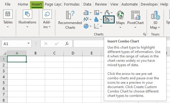
- As shown in the screenshot below, we must select the data table, go to the “Insert” tab in the ribbon, and select “Combo Charts,” as shown in the red rectangle and right arrow.

- Now, we must select the “Clustered Column” Excel chart in the options provided in the “Combo Charts” drop-down.

- Once the clustered chart is selected, the combo chart will be ready for display and illustration.
- If the chart needs to be changed to a different chart, we can right-click on the graphs and select “Change Chart Type,” as shown in the screenshot below.

- In the “Change Chart Type” window, we must select the data table parameters plotted on the secondary Y-axis by clicking the box with a tick mark.
For the current example, profit and expenses (in dollar value) are plotted on the primary Y-axis, and the headcounts are plotted on the secondary Y-axis.The screenshot below shows that the profit and expense parameters are changed to stacked bar charts, and headcount is selected as a line chart on the secondary Y-axis.

- Once the selections are made, we must click “OK.”
- Click the “Chart title” and rename the chart to the required title to change the name, as shown below.

- To change the background for the charts, click on the chart so that the “Design” and “Format” tabs in the ribbon will appear, as shown in the red rectangle. Now, choose the required style for the chart from the “Design” tab.
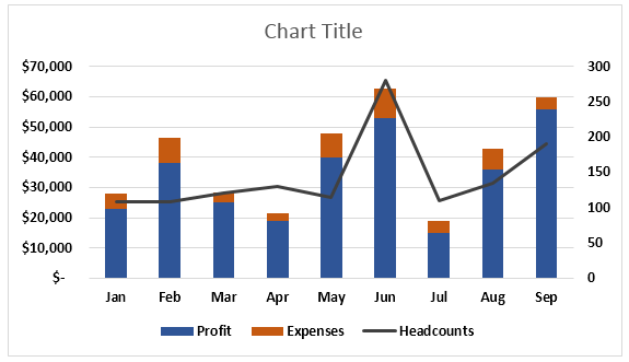
Below is the completed chart for this example:

Example #2
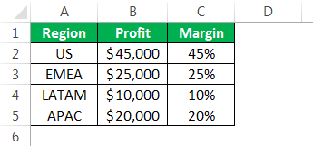
Consider the below table consisting of region-wise profit and margin data. This example explains an alternate approach to arriving at a combination chart in Excel.
The steps to create a Combo Chart are as follows:
Step 1: First, we must select the data table prepared, then go to the “Insert” tab in the ribbon, click on “Combo,” and then select the “Clustered Column – Line.”

Once the clustered chart is selected, the combo chart will be ready for display and illustration.

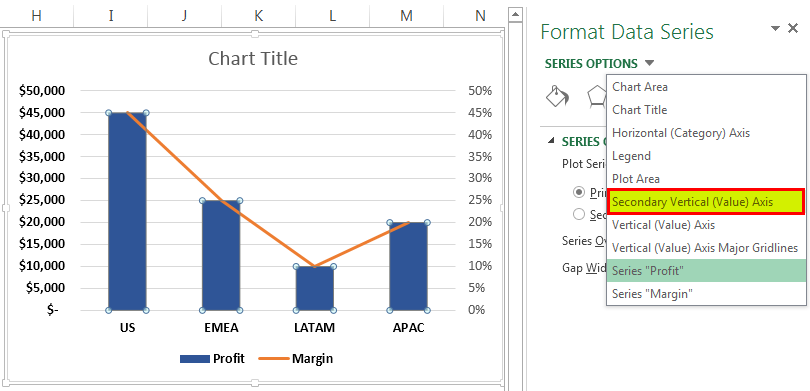
Step 2: Once the clustered column line is selected, the below graph will appear with a bar graph for for-profit and a line graph for margin. Now, we must choose the line graph. However, we noticed that the margin data in the chart is not visible. Thereby, we must go to the “Format” tab in the ribbon and click on the drop-down as shown in the red arrow towards the left, then select “Series Margin.”

Now, the Line Graph (orange graph) is selected.

Step 3: Now, we must right-click on the line graph in Excel and select “Format Data Series.”

Step 4: In the “Format Data Series” window, we must go to “Series Option” and click on the “Secondary Axis” radio button. It will bring the margin data on the secondary Y-axis. Below is the screenshot after selecting the secondary axis.

Step 5: Next, we must go to the “Series Options” drop-down and select “Secondary Vertical (Value) Axis” to adjust the scale in the secondary Y-axis.
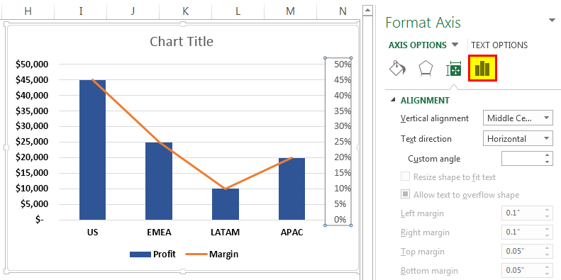
Step 6: Now, choose the “Axis Options.”
Step 7: Change the maximum bounds and major units per the requirement. For example, here, the maximum bound is selected to be 1, which would be 100%, and a major unit is changed to 0.25, which would have an equally distant measure of 25%.
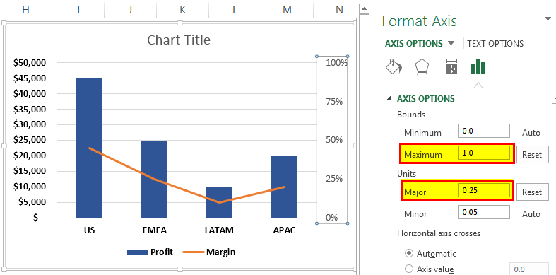
Below is the final combination chart in Excel. For example, 2.

Pros Of Combination Charts In Excel
- It can have two or more displays in one chart, providing concise information for better presentation and understanding.
- The combo chart in Excel showcases how we can illustrate the charts on both the Y-axis and talk to each other and their influences on each other based on the X-axis significantly.
- It could represent using different charts to display primary and secondary Y-axis data. For example, line and bar charts, bar and Gantt charts in Excel, etc.
- Best used for critical comparison purposes, which could help further analysis and reporting.
Cons Of Combo Charts In Excel
- The Chart can sometimes be more complex and complicated as the number of graphs on the charts increases. Thereby making it difficult to differentiate and understand.
- Too many graphs may make it difficult to interpret the parameters.
Important Things To Note
- The charts portray the data table containing a wide range of Y-axes in the same chart.
- It can also accommodate different data tables and does not necessarily need to be correlated.
Frequently Asked Questions (FAQs)
Explain the working of a Combination (Combo) Chart in Excel.
The Combination Charts in Excel represent two different data tables related to each other.
For example, there is a primary X-axis and Y-axis and an additional secondary Y-axis to help provide a broader understanding of one chart.
The chart provides a comparative analysis of the two graphs of different categories and the mixed data type, enabling the user to view and highlight higher and lower values within the charts.
The combo chart lets users summarize large data sets with multiple tables, and systematically illustrate the numbers in one chart.
How are Combo Charts in Excel inserted?
- Before Excel 2013 version, we generate a chart, and then right-click on the chart to open the “Format Data Series” and select the “Secondary Axis” option, as learnt in Example 2.
- From the Excel 2013 version, we select the data range – go to the “Insert” tab – go to the “Charts” group – click the “Combo Charts” option drop-down to select from the preset combo charts options, as shown below.
Why are the Combo Charts in Excel not working?
A few reasons the Combination Charts in Excel may not work are as follows:
• The dataset of the generated Combo Chart is modified or deleted.
• The secondary axis option in the “Format Data Series” is not selected to display the other dataset.
Recommended Articles
This article is a Guide to Combination Charts in Excel. We create charts with inbuilt ones or by combining multiple chart type, examples, downloadable template. You may learn more about Excel from the following articles: –