What Is Step Chart In Excel?
Step chart in Excel is used to create a visual representation of data which alters in a regular time interval. This chart is not available in Excel by default but it is highly useful to analyze price changes and stock exchange rates.

For example, consider the below example where the number of participants in different time intervals are mentioned.
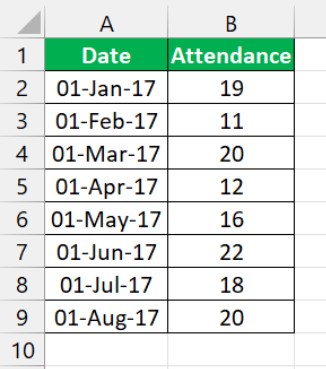
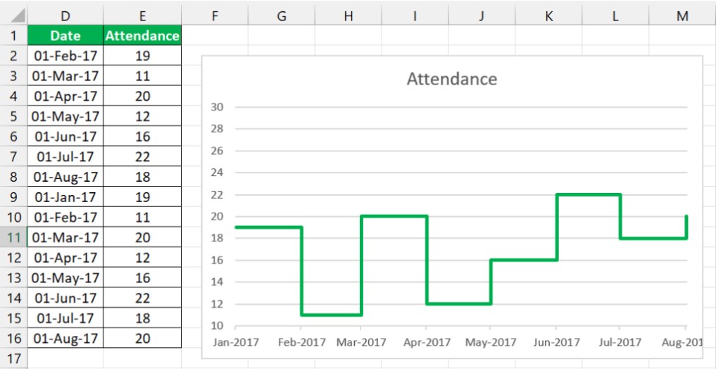
Now, using step chart in Excel, we can create a chart as shown in the below image.
Likewise, we can represent data visually using step chart in Excel. In this article, let us learn how to use and create step chart in Excel.
Key Takeaways
- The step chart in Excel is different from the line chart in Excel. The line charts show the data points’ trends without considering the exact time of change or fluctuation.
- In contrast, the step chart shows both the timing and data points trend between periods.
- Step charts are easier to understand than line charts in Excel as they enable clear visibility of the trend with a horizontal line.
- The step chart effectively conveys a story by displaying differences between periods. To avoid full dates on the horizontal axis, adjust the date format and minimum, maximum, and manor interval points.
How To Create Step Chart In Excel?
Since step chart is not available by default, we can create it using simple steps. Let us learn how to create step chart in Excel with detailed examples.
Examples
Example #1
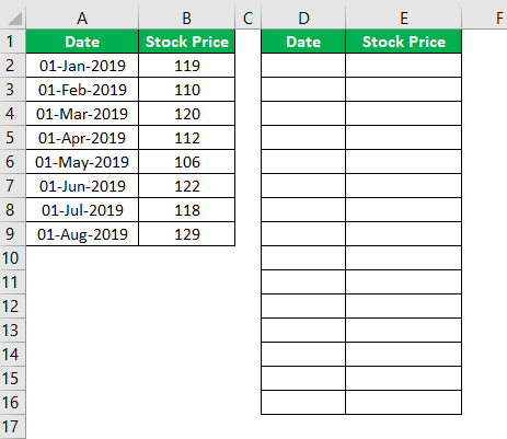
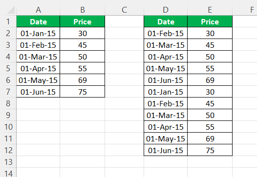
Consider the below examples showing dates and stock prices.
Now we will follow the below steps to create a step chart in excel.
- Insert two new columns with the same headers.

- Now copy the date values from A3 to A9 and paste in the new column D2. Here you need to ignore the first date value.
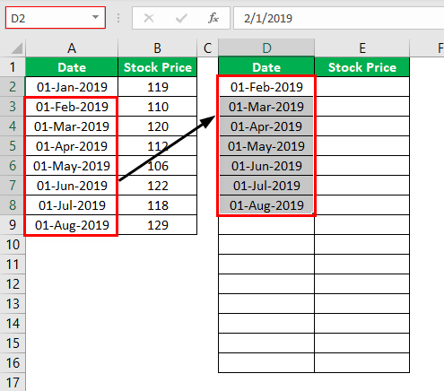
- Now copy the Stock Price from B2 to B8 and paste in E2. Here you need to ignore the last value.
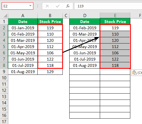
- Now copy actual data from A2 to B9 paste in D9 cell.

- Now, select the data and insert Line Chart.

- Select the vertical left axis and press Ctrl + 1 to open up the format data series option.
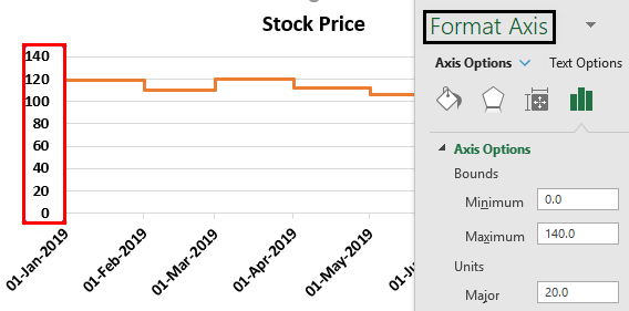
- Now click on “Axis Option” set the minimum value to 100, maximum to 135, and major value to 5.

- Now click on the horizontal axis and click on “Number” formatting and change the date format to “MMM-YYYY.”

- Change the “Line” color to green. Now we have our chart ready.
Likewise, we can create step chart in Excel.

Example #2
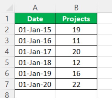
Consider the below example showing projects and date in columns A and B.
Now we will follow the below steps to create a step chart in excel.
- First, insert two new columns with the same headers.
- Now copy the date values from A3 to A7 and paste in the new column D2. Here you need to ignore the first date value.
- Now copy the Projects from B2 to B6 and paste in E2. Here you need to ignore the last value.
- Next copy actual data from A2 to B7 and paste it in the column.
We will something that appears as shown in the below image.

- Now, select the data and insert Line Chart.
- Select the vertical left axis and press Ctrl + 1 to open up the format data series option.
- Now click on “Axis Option” set the minimum value to 10, maximum to 30, and major value to 2.
- Now click on the horizontal axis and click on “Number” formatting and change the date format to “MMM-YYYY.”
We can see the chart as shown in the below image.

Likewise, we can create step chart in Excel.
Example #3
Consider the below example showing projects and date in columns A and B.
Now we will follow the below steps to create a step chart in excel.
- First, insert two new columns with the same headers.
- Now copy the date values from A3 to A7 and paste in the new column D2. Here you need to ignore the first date value.
- Now copy the Projects from B2 to B6 and paste in E2. Here you need to ignore the last value.
- Next copy actual data from A2 to B7 and paste it in the column.
We will something that appears as shown in the below image.
- Now, select the data and insert Line Chart.
- Select the vertical left axis and press Ctrl + 1 to open up the format data series option.
- Now click on “Axis Option” set the minimum value to 10, maximum to 30, and major value to 2.
- Now click on the horizontal axis and click on “Number” formatting and change the date format to “MMM-YYYY.”
We can see the chart as shown in the below image.

Likewise, we can create step chart in Excel.
Difference Between Line Chart And Excel Step Chart
Below are some of the general differences.
Difference #1
A-Line Chart shows the trend of data points, and it will not focus on the exact time of change or fluctuation of data points from one period to another.
On the other hand, “A Step Chart” shows the trend shows the exact time of change along with the trend of the data points as well.
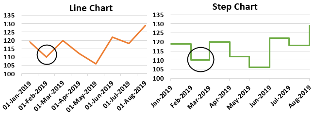
As you can (red marked area), the line chart shows that after the first month, it shows a consistent decline in stock price, but the step chart shows that the price actually declined only in February month.
Difference #2
Finding the actual trend could be tricky with a line chart because it doesn’t show the exact trend of change and how much. But a step graph due to its horizontal line can show the actual trend with clear visibility.
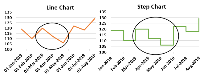
As you can see above, the line chart shows that the decline started from Mar to June, but the Step chart also shows a decline but not with consistent decline throughout the months.
Important Things To Note
- Showing differences from one period to another is the main advantage of this chart.
- It can tell the story better than the Line Chart.
- If you don’t want to show the full date in the horizontal axis of the chart, then you can change the date format under the chart formatting section.
- You need to adjust the minimum value, maximum value, and manor interval point to fit in your chart to look better.
Frequently Asked Questions (FAQs)
What are the advantages of step chart in Excel?
A step chart is a graphical chart that displays the data change and frequency over time with the help of the vertical axis, which shows the data change, and the horizontal axis, denoting the data consistency.
When to use a step chart in Excel?
The step chart in Excel is helpful for data that changes irregularly over time, such as interest rates and time.
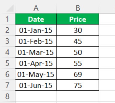
For example, consider the following example where we have to find the total every day.
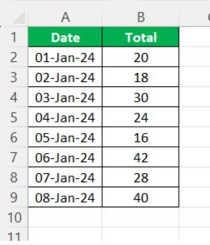
Now, using step chart in Excel, we can create the chart as shown in the below image.

Likewise, we can use step chart in Excel.
What are the characteristics of a step chart in Excel?
A step chart marks the Excel data points utilizing the horizontal and vertical transitions. This chart helps measure any changes, such as price changes in commodities, interest rates, etc.
Recommended Articles
This has been a guide to the step chart in excel. Here we discuss how to create a step chart along with examples and a downloadable excel template. You may learn more about excel from the following articles –