Excel Non-Linear Regression
Excel non-linear regression is the widely used model in the statistics field. The dependent variables are modeled as non-linear functions of model variables and one or more independent variables.
We must remember that “linear regression in excel” fits straight linear lines, while non-linear regression creates curves from the data sets.”
Examples of Non-Linear Regression in Excel
Example #1
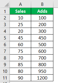
Let us look at the linear chart first and consider the below data.

In the above data, we have two variables, “Sales” and “Adds.”
We need to understand which dependent variable is and which independent variable is.
In general, we all know “Adds” play a vital role in increasing the possibility of revenue generation. So, “Sales” is dependent on “Adds” this means “Sales” is a dependent variable, and “Adds” is an Independent variable.
The general rule is one of the variables is going to affect the other one. So, in this case, our independent variable “Adds” affects our dependent variable, “Sales.”
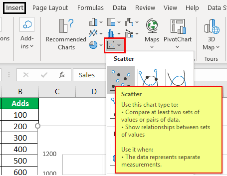
For this data, let us create a “Scatter” chart to see these numbers graphically. Then, follow the below steps to insert the excel chart.
Follow the below steps to insert the Excel chart.
- First, we must copy and paste the above data to the spreadsheet.
- Then, select the data.
- Go to the “INSERT” tab and insert a scatter chart.
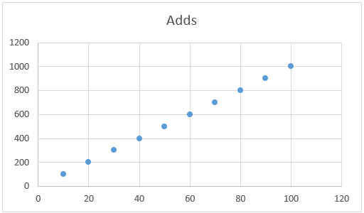
Now, we will have a chart like this. For this chart, we need to insert a linear line to see how linear these data points are.
Select the chart to see two new tabs in the ribbon, “Design” and “Format.”
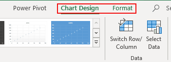
Under the “Design” tab, go to “Add Chart Element.”
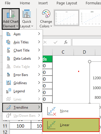
Click on the drop-down list of “Add Chart Element” >> “Trendline” >> “Linear.”

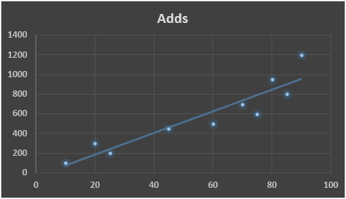
It will add a linear trend line to the chart, and it looks like this.

From this chart, we can see a clear relationship between “Sales” and “Adds.” As the number of “Adds” increases, the “Sales” numbers invariably increase, which is proved right by our linear line in the chart. It just fits on the linear line.
Now, look at the example data of the same thing.
If we insert the chart and trend line for this data set, we will get the below kind of chart.
If we look at our data set’s linear line and dot, there seems to be no exact relationship between the two data points.
These data sets are called Excel “non-linear regression” data points.
Example #2
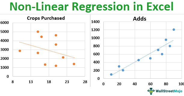
We will see another example of this Excel non-linear regression data point. Consider the below data.

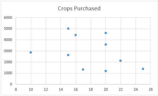
Above is the data on rainfall and crops purchased data.
- Now, we need to see the relationship between rainfall and crops purchased. For this, we must create a scatter chart.
- Insert a linear line for the chart.
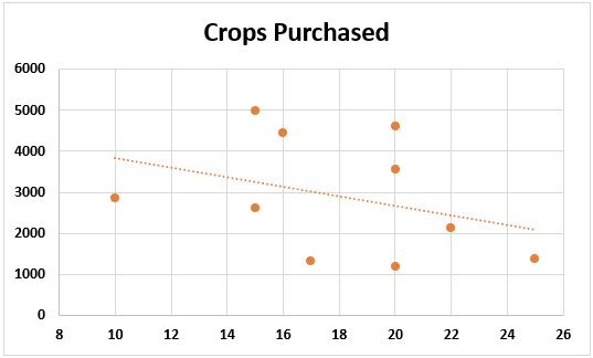
We can see that different crop quantities are purchased for the same rainfall set. For example, look at the rainfall at 20. In this rainfall range, crop purchased quantities are 4598, 3562, and 1184.
It may be due to the season as well. For example, rain could be the same amount, but farmers have purchased different quantities due to different time frames.
Things to Remember
- Linear and non-linear are two different things from each other.
- A strong statistical background is required to understand these things.
- We must understand what linear regression is before learning about non-linear.
Recommended Articles
This article is a guide to Non-Linear Regression in Excel. We discuss how to do non-linear regression in Excel, along with examples and a downloadable Excel template. You may learn more about Excel from the following articles: –