What Is Error Bars In Excel?
The Error Bars in Excel are the graphical representation of a two-dimensional framework to denote errors, that helps us understand the relation or errors in the data variables and displays the standard error, standard deviation, or percentage value in the form of Bars.
Key Takeaways
- The Error Bars in Excel helps us comprehend the variability of data given on a two-dimensional framework and displays the standard error, standard deviation, or percentage.
- It helps indicate the estimated error or uncertainty to give a general sense of how accurate a measurement is, where the accuracy is understood by the marker drawn over the original graph and its data points.
- Error Bars are usually by drawing cap-tipped lines extending from the center of the plotted data point, and their length usually helps reveal the uncertainty of a data point.
How To Add Error Bars In Excel?
We can add Error Bars In Excel in 2 ways, namely:
- Use the inbuilt Excel Error Bars as,
- Error Bars with Standard Error.
- Error Bars with Standard Deviation.
- Error Bars with Percentage.
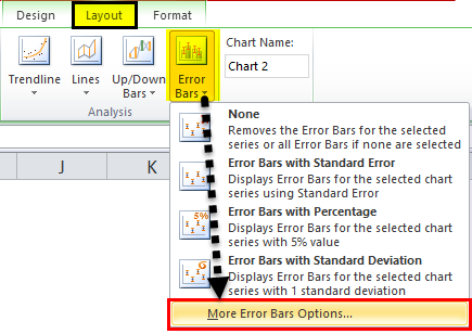
- Custom the Error Bars using the “More Error Bars Options…”
Examples
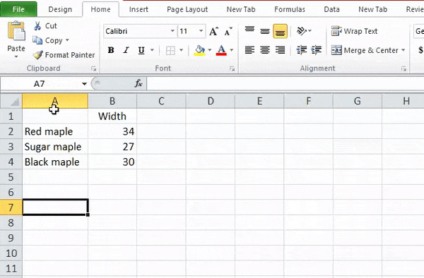
We will see the following data to see how we can Add Excel Error Bars using the inbuilt Error Bars with Standard Error, Standard Deviation, and Percentage.
Example #1
The steps toAddError Bars in Excelare,
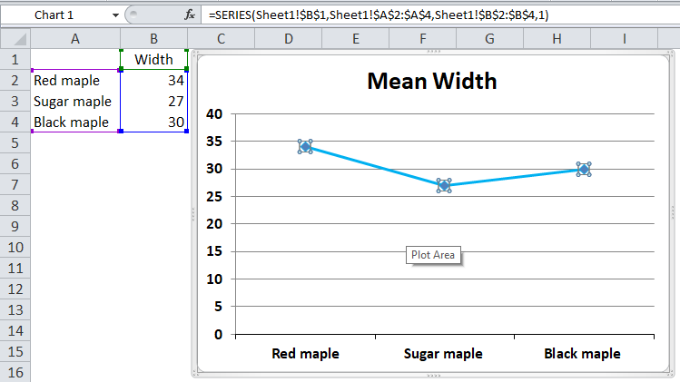
- First, we must select the data and the line graph from the “Insert” tab.
- Next, we will get the following line graph by clicking the line graph.
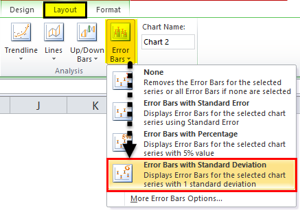
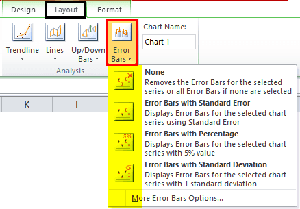
- We can find the “Error Bars” option under the “Layout” tab under the “Analysis” group. For example, the following screenshot shows the same.
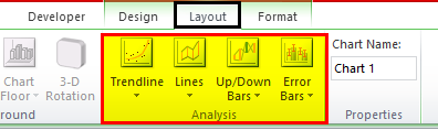
- There are various “Error Bars” options available.

- “Error Bars with Standard Error.” “Standard Error,” i.e., SE, is the standard deviation of a sampling distribution. The magnitude of SE gives an index of the precision of the estimate of the parameter. The standard error is inversely proportional to the size of the sample. That means the smaller the sample size, the greater the standard errors.
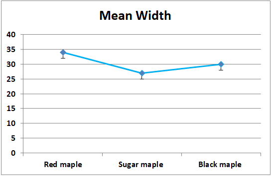
In the below screenshot, theError Barswith standard errors are given. All the data points in the series display the amount of error in the same height and width, forYandXError Bars, respectively.The below screenshot shows that the straight line is drawn from the minimum of the maximum value, i.e., “Red maple” overlaps with the outermost value of the species “Black maple”. It signifies that the data for one group is not different from the other.

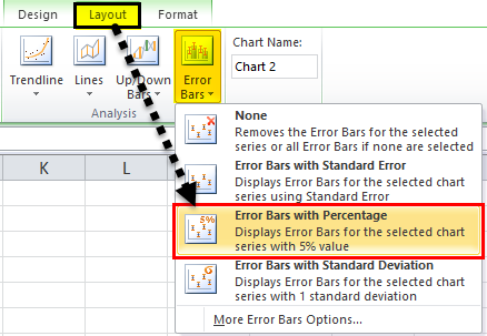
- Error Bars with Percentage
It uses the percentage specified in the “Percentage” box to calculate the error amount for each data as a percentage of the value of that particular data point. The YError Barsand XError Barsare based on a percentage of the value of the data points and vary in size as per the percentage value. By default, it takes the percentage as 5%.The default 5% value can be seen from the “More Error Bars Options” in the screenshot below.
- Error Bars with Standard Deviation
“Error Bars with Standard Deviation” is the average difference between the data points and their mean. Usually, a one-point standard deviation is considered while creating theError Bars. The standard deviation is used when the data is normally distributed, and the pointers are usually at equal distances.A line is drawn on the maximum data point, i.e., “Red maple” coincides with the maximum error point of “Black maple”. It signifies that the data for one group is not different from the other.
How To Add Custom Error Bars In Excel?
We can also make custom Error Bars apart from the three Error Bars, i.e., Error Bars with standard error, Error Bars with standard deviation, and Error Bars with percentage.
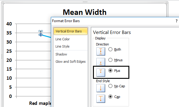
The minus display is the error to the lower side of the actual value. So, click on the “minus” tab.

Similar to minus, the plus can also be taken, representing the error to the upper side of the actual value. Therefore, click the “plus” option.

We can also visualize the Error Bars without the cap. For example, in the vertical Error Bars tab, we need to click or select direction as an end style and no cap.


Important Things To Note
- Depending on the length of the Error Bars, we can estimate the error. For example, a short error bar shows that the values are more concentrated, directing that plotted average value is more likely to be reliable. On the other hand, a long error bar indicates that the values are more spread out and are less likely to be reliable.
- In the case of skewed data, the length on each side of the Error Bars would be unbalanced.
- The Error Bars usually run parallel to the quantitative scale axis. Therefore, the Error Bars can be visualized horizontally or vertically depending on whether the quantitative scale is on the X-axis or the Y-axis.
Frequently Asked Questions (FAQs)
Where are the Error Bars in Excel found?
• First, ensure to plot a Scatter chart or a Line chart using the dataset.
• Next, click anywhere on the chart to activate the “Chart Design”, “Layout”, and the “Format” tabs.
• Then, select the “Layout” tab → go to the “Analysis” group → click the “Error Bars” option drop-down → select the “Error Bars with Standard Error”, “Error Bars with Percentage”, “Error Bars with Standard Deviation”, or “More Error Bars Options…” options as per our requirements, as shown below.
How to create a Scatter Chart to display Error Bars in Excel?
We can create a Scatter Chart as follows,
First, choose the dataset → select the “Insert” tab → go to the “Charts” group → click the “Insert Scatter (X, Y) or Bubble Chart” option drop-down → select the “Scatter” chart type from the “Scatter” category, as shown below.
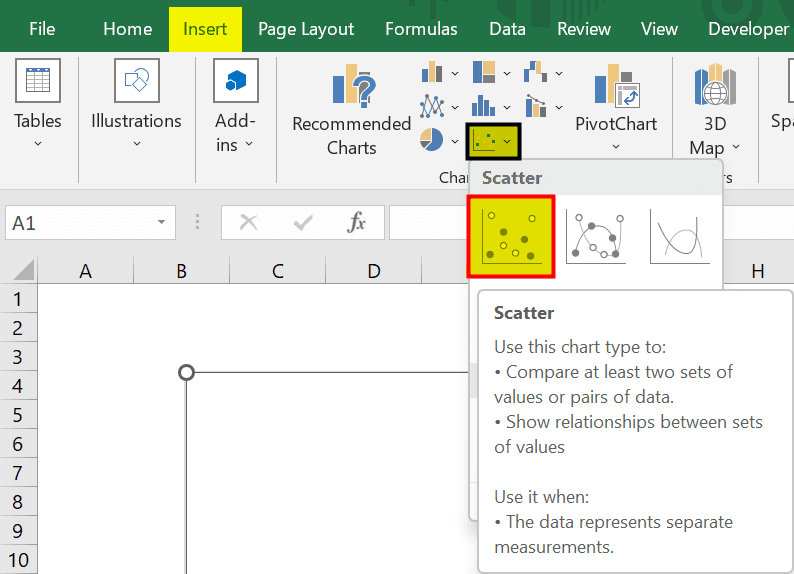
The Scatter chart will generate automatically, then we can click the chart to activate the “Layout” tab to “Add the Error Bars”.
How to create a Line Chart to display Error Bars in Excel?
We can create a Line Chart as follows,
First, choose the dataset à select the “Insert” tab → go to the “Charts” group → click the “Insert Line or Area Chart” option drop-down → select the “Line” chart type from the “2-D Line” category, as shown below.

The Line chart will generate automatically, then we can click the chart to activate the “Layout” tab to “Add the Error Bars”.
Recommended Articles
This article has been a guide to Error Bars in Excel. Here we create, add, customize Error Bars, to see data relation, errors, examples, downloadable excel template. You may learn more about Excel from the following articles: –